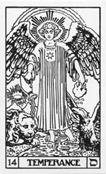
 The structure of Temperance comes about from a quirk of the formatting: it was going to be very difficult to make a chibi angel stand near the bottom of the card with one foot in the water and one foot out. Also, I dislike drawing feet. Really dislike drawing feet. So that’s the first major reason that I went with the BOTA version rather than the Waite Smith version. Secondly, I love drawing cute things, and getting the chance to draw a cute lion and a cute eagle was a lot better than trying to figure out a way to manoeuvre (sorry, British spell check) the angel around and fill in the space with more mountains.
But I didn’t leave the WS design out of it entirely. Upon studying the card I learned that if you look closely at Pixie’s original Temperance you’ll notice that the name of god, YHVH, is worked into the fabric of her robes. Being the cheeky pagan that I am, I couldn’t let that ride. So instead of YHVH I went with the name of Ashera (אשרה), YHVH’s early consort before she was killed off by monotheistic dicks. You can see it worked in twice around the gold of her collar.
 Secondly, the cup that the angel is pouring water out of has a small history. It’s inspired by Jerrod Maruyama’s 6 of Cups from the Super Punch Tarot. I was a bit dismayed by this card when I originally saw it, both because I was afraid people would think I ripped off the idea and because I thought I’d never be able to produce anything quite as fantastic as his powerfully happy image. I ended up buying the print that they used in the show and it hangs now over my monitor as a daily inspiration for how beautiful and energetic the Chibi Tarot can be. Temperance is, I think, the first card that really begins to approach the exuberance that Jerrod infuses into all of his work.
Temperance also represents my growth as a digital artists. As I was studying Maruyama’s work I had an epiphany about the visual construction of the cup about how creating a cup in that style could be done quickly and easily using a cunning combination of gradients. I won’t go into detail here, as I’m not sure most of my readers are interested in the Byzantine application of gradients in vector art, but the moment of seeing how something can be done more easily was a powerful one for me, symbolizing my unconscious integration of the tools I’m using for the deck. So the cup that the angel holds is an homage to Jerrod’s 6 of Cups, and the mysteries that it helped me to unravel.
 There’s also one interesting mistake in this card that I forgot to remove before I went live with it (and will leave in for now). If you look closely at the pool of water in the foreground of the card you may notice some circular ripples moving outward, apparently from nothing. (You can see it better in the deviantART version ). Those ripples were originally moving out from the stick that the eagle is sitting on. This is another example of my laziness. Not the ripples, that’s an example of my sloppiness. The stick really has no right to be coming out of the ground there, but having the eagle sitting on a rock didn’t make that much more sense, and was a LOT harder to draw than having the eagle on a stick. When I stuck the fronds in at the edge of the pool it made the eagle stand out much more than the lion, so I just moved the eagle and his perch behind them…completely forgetting the ripples were still in the water.